Choosing colors for your home can feel straightforward until everything is in the same room. Shades that looked perfect on their own can clash once they’re paired with flooring, furniture, and lighting.
Getting the palette right comes down to how colors interact, not just how they look individually. Color matching tips for your home palette help you create a cohesive flow from room to room without second-guessing every decision.
Factors like undertones, contrast, and natural light all influence how colors appear throughout the day. With a thoughtful approach, you can build a balanced palette that feels connected, comfortable, and visually consistent across your entire home.
Color Matching Ideas That Make Rooms Flow Better
How Do You Match Wood Floor Colors With Wall Paint For Perfect Home Color Harmony?

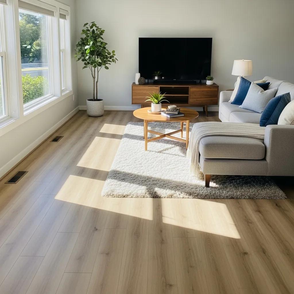
Getting color matching right between wood floor colors and wall paint can make a space feel intentional and well put together. When the tones work with each other, the room feels balanced without drawing attention to any one element. The goal is not just to match colors, but to create a sense of flow that carries from floor to wall.
A good starting point is to look at the undertones in your flooring. Wood floors are rarely just “brown.” They often lean warm, cool, or neutral. Once you identify that base tone, choosing a wall color becomes much more straightforward. Instead of guessing, you are working with what is already in the room.
Understanding Color Theory In A Practical Way
While color theory can sound technical, the basics are easy to apply. One of the most important concepts is temperature. Warm tones include shades with red, orange, or yellow undertones, while cool tones lean toward blue or gray. Keeping these consistent between your floor and walls helps the space feel cohesive.
For example, if your wood flooring has a warm, golden tone, pairing it with a cool gray wall can create a subtle disconnect. It does not always look wrong, but it can feel slightly off. On the other hand, using a warm neutral on the walls helps everything blend more naturally.
Contrast is another useful tool. Instead of trying to match everything exactly, aim for balance. A darker floor can look great with lighter walls, while pale flooring often benefits from slightly deeper wall tones to avoid a washed-out look.
Choosing Wall Colors Based On Your Flooring
Once you understand the undertones, the next step in color matching is selecting wall colors that complement rather than compete. Neutral wall shades are often the easiest to work with because they provide flexibility without overwhelming the space.
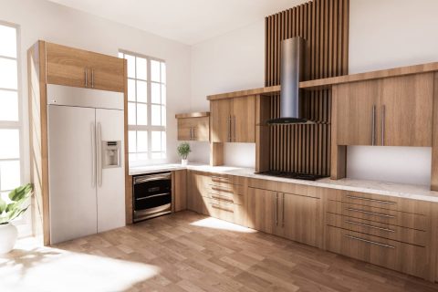
Beige walls tend to pair well with warmer wood tones like oak or walnut, creating a comfortable and inviting feel. Cooler wall colors, such as soft gray or muted blue, can work nicely with lighter or more neutral-toned flooring, especially in spaces where you want a calm, modern look.
If you are working with darker floors, lighter wall colors can help keep the room from feeling too heavy. In contrast, lighter wood floors can handle slightly richer wall shades without making the space feel closed in. The key is to let one element lead while the other supports it.
How Lighting Affects Color Matching Decisions
Lighting plays a bigger role in color matching than most people expect. Natural light, warm bulbs, and cool lighting can all change how colors appear throughout the day. A wall color that looks perfect in the store might feel completely different once it is in your home.
Testing paint samples directly on your walls is one of the simplest ways to avoid surprises. Look at the color during different times of day and under different lighting conditions. This helps you see how it interacts with your flooring in real conditions, not just under showroom lighting.
Paying attention to lighting also helps you fine-tune your choices. If your room gets a lot of natural light, you may be able to use slightly deeper tones without darkening the space. In rooms with limited light, softer and lighter shades usually work better.
Creating A Cohesive Look That Feels Intentional
Strong color matching is not about finding a perfect one-to-one match. It is about creating a relationship between your floors and walls that feels natural. When tones align and contrast is used thoughtfully, the entire room comes together without feeling forced.
Taking the time to observe undertones, test colors, and consider lighting leads to better decisions overall. Instead of second-guessing your choices later, you end up with a space that feels consistent from every angle.
What Are The Top Flooring Color Trends For 2026 To Inspire Your Home Color Schemes?

Flooring trends for 2026 are moving toward comfort, subtle contrast, and natural influence. Instead of bold or overly dark finishes, homeowners are leaning into tones that feel easy to live with day to day.
This shift makes color matching more flexible, since many of these shades are designed to work across a wide range of wall colors and design styles.
Another noticeable trend is the move toward finishes that show variation. Slight differences in grain and tone add depth without overwhelming the space. This makes it easier to build a cohesive look, because the flooring already carries some visual interest on its own.
Why Warm Neutral Flooring Continues To Lead
Warm neutrals are expected to remain a dominant choice, especially for living areas and open floor plans. Colors like taupe, sandy beige, and soft caramel create a grounded base that feels both modern and familiar. These tones tend to reflect light well, which helps rooms feel brighter without relying on stark whites.
From a color-matching perspective, warm neutrals are especially forgiving. They pair easily with a wide range of wall colors, from soft creams to muted greens and even deeper accent tones. This flexibility allows homeowners to update wall colors over time without needing to replace flooring.
Another reason these tones are popular is how they influence the overall mood of a space. Warm flooring tends to make rooms feel more inviting, which is often the goal in shared areas like living rooms and kitchens. It creates a sense of continuity that carries throughout the home.
How Cool Tones Are Being Used More Strategically
While warm tones dominate, cool flooring colors are gaining traction in more specific settings. Shades like soft gray, weathered oak, and subtle blue undertones are being used to create calm, understated interiors. These colors work particularly well in bedrooms, home offices, and spaces designed for relaxation.
Successful color matching with cool floors often depends on keeping the palette soft. Pairing these tones with light wall colors such as pale lavender, misty blue, or muted green helps maintain a cohesive feel. When done right, the result is a space that feels quiet and balanced rather than cold.
Cool tones also tend to highlight modern design elements. Clean lines, minimal decor, and simple textures stand out more when the flooring does not compete for attention. This makes them a strong choice for contemporary interiors.
Mixing Trends Without Losing Cohesion
One of the more practical trends for 2026 is the willingness to mix tones within the same home while still maintaining a consistent look. Instead of using identical flooring everywhere, homeowners are choosing complementary shades for different areas.
This approach requires a more intentional take on color matching. The goal is to ensure that transitions between rooms feel natural, even if the flooring changes slightly.
For example, a warm neutral in the main living area might shift to a slightly cooler tone in a bedroom, as long as the undertones still relate to each other.
Using consistent wall colors or trim can help tie everything together. This creates a visual link between spaces, even when the flooring varies. It also allows each room to have its own character without feeling disconnected from the rest of the home.
Choosing A Trend That Works Long Term
While it is helpful to follow trends, the most important factor is how well the flooring fits your space over time. Trends like warm neutrals and soft cool tones are popular partly because they are easy to live with and adapt to changing styles.
When approaching color matching, think beyond the initial look. Consider how the flooring will interact with furniture, lighting, and future updates. A well-chosen color will continue to work even as other elements in the room change.
By focusing on versatility and balance, these 2026 flooring trends offer more than just visual appeal. They provide a solid foundation for creating spaces that feel cohesive, comfortable, and easy to update over time.
How Can Design Harmony Principles Guide Your Interior Color Matching?

Design harmony is what turns a collection of individual choices into a space that feels complete. When applied thoughtfully, it helps color matching feel intentional rather than pieced together.
Instead of focusing on single colors in isolation, harmony looks at how everything interacts, from flooring to wall paint and even how light moves through the room.
A well-balanced space does not rely on exact matches. It depends on consistency in tone, contrast, and visual flow. Once you understand how these elements work together, making decisions becomes more straightforward and far less guesswork.
Using Visual Balance To Coordinate Floors And Walls
One of the most useful ways to approach color matching is by thinking in terms of balance. Rather than trying to match your flooring and walls perfectly, aim to create a relationship between them. This often comes down to how light or dark each surface is and how much contrast you want in the room.
If your flooring is dark, lighter walls can help open up the space and keep it from feeling too heavy. On the other hand, if your floors are light, slightly deeper wall tones can add definition and prevent the room from feeling flat.
This contrast creates structure without making the space feel disjointed. Another helpful tool is the color wheel, but it works best when used as a guide rather than a rule.
It can point you toward complementary tones, but real-world color matching also depends on undertones, finishes, and lighting conditions. Seeing how colors behave together in your actual space is always more reliable than relying on theory alone.
Matching Colors To The Purpose Of Each Room
Design harmony also depends on how a space is used. Different rooms call for different moods, and color matching should support that purpose rather than work against it.
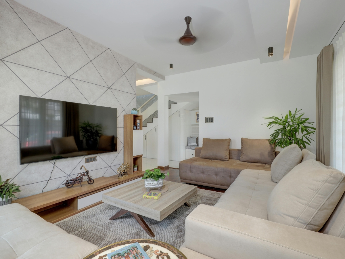
In living areas, warmer tones often help create a sense of comfort and connection. Flooring with subtle warmth paired with neutral or soft wall colors can make the space feel inviting without being overly styled. These combinations tend to work well in areas where people gather and spend time together.
Bedrooms, on the other hand, often benefit from a quieter approach. Cooler tones or muted neutrals can help create a more restful environment. When color matching for these spaces, the goal is to reduce visual noise and keep the palette calm and consistent.
Kitchens and workspaces fall somewhere in between. They benefit from clarity and brightness, so pairing mid-tone flooring with clean, light wall colors can help maintain a sense of openness while still feeling grounded.
Testing And Adjusting Before Final Decisions
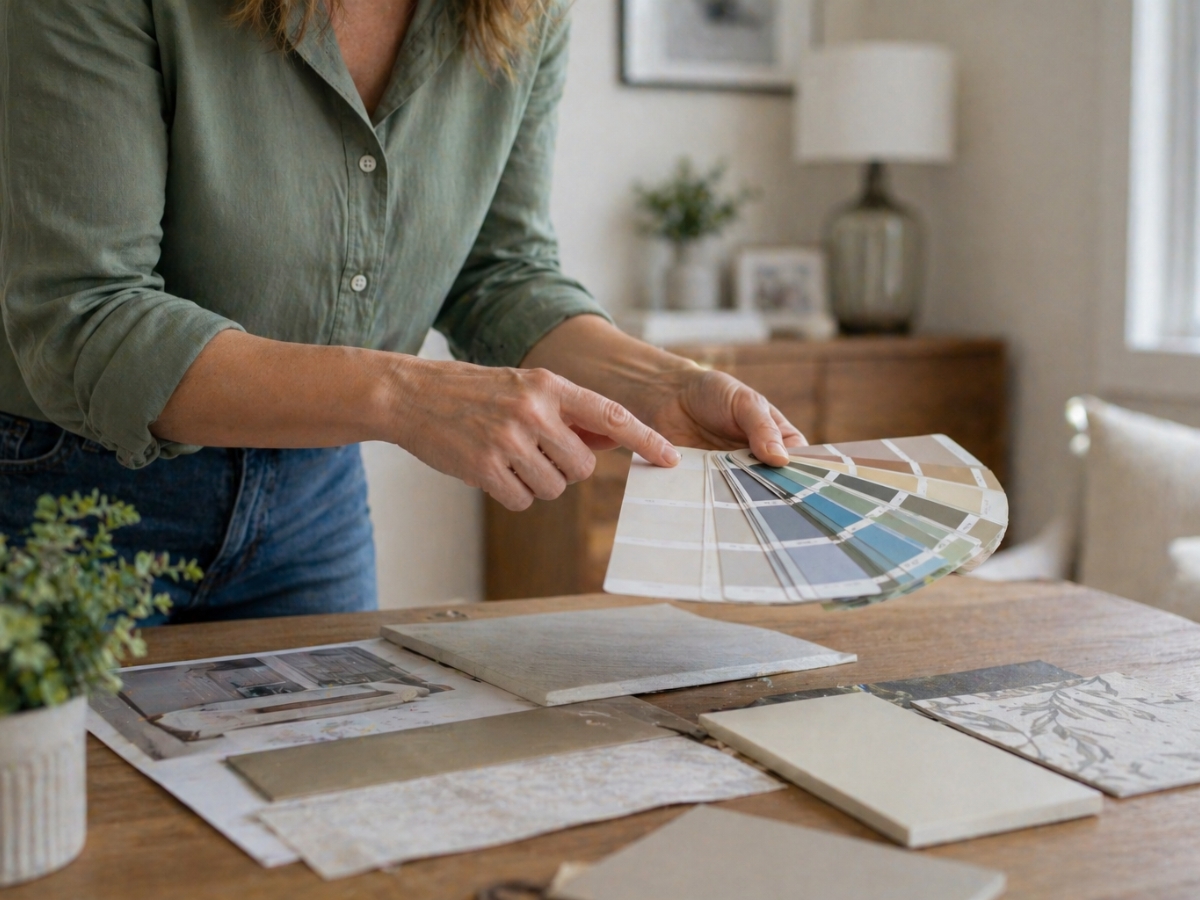
Even with a clear plan, testing is one of the most important steps in achieving good color matching. Paint and flooring samples can look very different once they are in your home, especially when exposed to natural and artificial light.
Placing samples side by side allows you to see how they interact throughout the day. Morning light, afternoon brightness, and evening shadows can all shift how colors appear. Taking the time to observe these changes helps you avoid combinations that might feel off once everything is installed.
This step also gives you the chance to fine-tune your choices. Sometimes a slightly warmer or cooler variation of a color can make a noticeable difference in how well everything works together.
Creating Flow From Room To Room
Design harmony is not just about individual rooms. It also involves how spaces connect. Consistent color matching across a home creates a sense of continuity, even when each room has its own character.
This does not mean every room needs to use the same colors. Instead, it is about maintaining a shared tone or palette that carries throughout the space. Repeating certain undertones or using similar neutrals can help tie everything together without making the design feel repetitive.
When done well, this approach allows each room to feel distinct while still belonging to a larger, cohesive design. That balance is what makes a home feel thoughtfully designed rather than randomly assembled.
What Flooring Color Consultation Services Does Diaz Hardwood Floors Offer?

Choosing the right flooring can feel overwhelming, especially when you are trying to make everything in your home work together. Diaz Hardwood Floors focuses on simplifying that process through consultation services that center on thoughtful color matching.
Instead of leaving homeowners to guess, their approach is built around helping each client find options that align with their space, lighting, and overall design goals. Their services go beyond simply presenting samples.
The goal is to guide homeowners toward flooring choices that feel cohesive with what they already have, whether that includes wall colors, cabinetry, or furniture. This kind of guidance can make a noticeable difference in how finished and balanced a space feels once everything is in place.
How Personalized Color Matching Shapes A Cohesive Design
Personalized color matching is one of the most valuable parts of working with a flooring specialist. Every home has its own combination of lighting, materials, and existing color tones, which means a one-size approach rarely works well.
By taking these factors into account, Diaz Hardwood Floors helps homeowners avoid common mismatches that can disrupt the overall look of a room. During the consultation, attention is given to undertones in both flooring and surrounding elements.
For example, a floor with warm undertones will be evaluated alongside wall colors and finishes to ensure everything works together naturally. This process creates a sense of continuity, rather than having each element feel separate.
Another benefit of personalized color matching is that it allows for better long-term flexibility. When the foundation of a room is well coordinated, it becomes easier to update furniture or paint later without needing to rethink the flooring. This makes the initial decision more practical and adaptable over time.
What To Expect During The Consultation Process
The consultation process is designed to be straightforward while still offering enough detail to guide confident decisions. It usually begins with a conversation about your goals, preferences, and how you use your space. This helps narrow down options that not only look good but also fit your daily needs.
From there, the focus shifts to color matching in a more applied way. Samples are reviewed in the context of your home, allowing you to see how different tones interact with your lighting and existing finishes.
This step is important because colors can appear very different depending on their surroundings. Rather than rushing into a decision, the process encourages comparison and adjustment.
Small shifts in tone or finish can make a big difference, and having expert input at this stage helps refine the final choice. The goal is to arrive at a flooring option that feels right from every angle, not just in a showroom setting.
How Installation Completes The Design Vision
Once the flooring choice is finalized, professional installation ensures that the design comes together as intended. Even the best color matching decisions can fall short if the installation is not handled properly. Attention to detail during this stage helps maintain the integrity of the overall look.
Proper installation also supports consistency across the space. Transitions between rooms, alignment of planks, and finishing details all contribute to how cohesive the final result feels.
When these elements are handled carefully, the flooring becomes a seamless part of the home rather than something that stands out for the wrong reasons.
Why Expert Guidance Makes A Difference
Working with a team that understands both design and installation helps remove much of the uncertainty from the process. Color matching is not just about choosing something that looks good on its own. It is about understanding how that choice interacts with everything else in the room.
Which Case Studies Showcase Successful Color Palette Projects By Diaz Hardwood Floors?

Looking at real projects is one of the most helpful ways to understand how color matching works in practice. Diaz Hardwood Floors has completed a range of installations where flooring and wall colors come together in a way that feels balanced and intentional.
These examples highlight how thoughtful choices can transform a space without relying on overly complex designs. Each project starts with a different set of conditions, including lighting, room size, and existing finishes.
By adapting the approach to each home, the final result feels tailored rather than generic. This is where color matching becomes less about rules and more about reading the space correctly.
How Homeowners Achieve Cohesion Through Color Matching
In many successful projects, the key to design harmony is not choosing bold colors, but choosing the right relationship between tones. One example involved a home with light gray walls paired with warm oak flooring.
At first glance, this might seem like a mix of cool and warm elements, but the tones were carefully balanced so neither one felt out of place.
The flooring added warmth and depth, while the walls kept the space feeling open and modern. This type of color matching works because it creates contrast without conflict. Instead of competing, each element supports the overall look.
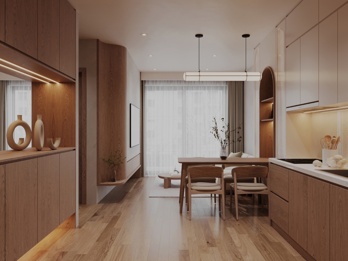
Another project focused on soft, neutral layering. The homeowner chose a light wood floor with subtle grain variation and paired it with warm off-white walls.
The result was a space that felt bright but still grounded. This approach shows how color matching can be used to create a calm, cohesive environment rather than a high-contrast design.
Popular Combinations That Work In Real Homes
Certain combinations tend to appear more often in real projects because they are reliable and adaptable. One of the most common is white or off-white walls with darker hardwood flooring.
This pairing creates a clear contrast, which helps define the space and adds visual interest without making the room feel busy.
Another frequently used option is soft beige walls with light oak flooring. This combination leans into warmth, making it a strong choice for living areas and family spaces. It creates a welcoming feel while still allowing flexibility for furniture and decor changes over time.
For more modern interiors, cool gray walls paired with deeper charcoal or smoked wood flooring are becoming increasingly popular.
This style works well in homes with clean lines and minimal design elements. The color matching here focuses on consistency in tone, which helps maintain a sleek and unified appearance.
Why Real-World Examples Matter More Than Trends
While trends can offer inspiration, case studies show how those ideas actually perform in lived-in spaces. Lighting, layout, and daily use all influence how colors come together. Seeing how color matching works in real homes helps homeowners make more practical decisions.
For example, a combination that looks appealing in a showroom might feel too dark in a space with limited natural light. Real projects reveal these nuances and show how small adjustments can improve the final result.
These examples also highlight the importance of flexibility. Many successful designs are not built around a single standout feature, but around a series of coordinated choices that work together over time.
Applying These Insights To Your Own Space
The main takeaway from these case studies is that strong color matching is about balance and context. It is less about following a specific formula and more about understanding how different elements interact within your home.
By looking at how others have combined flooring and wall colors successfully, it becomes easier to identify what might work in your own space. Whether you prefer contrast or subtle layering, the goal is to create a design that feels consistent from room to room.
With the right approach, even simple combinations can deliver a polished and cohesive result that holds up over time.
Conclusion
Creating a cohesive color palette for your home is about more than choosing pretty shades—it’s about achieving harmony between your walls, flooring, cabinetry, and furnishings to create a space that feels intentional, balanced, and inviting.
When you’re ready to select flooring that complements your perfect palette with durability and style, trust the experts at Diaz Hardwood Floors.
Ready to bring your color vision to life from the ground up? Call 404-791-0444 or get a free quote through our website form. Let our team help you choose the ideal flooring to anchor your home’s beautiful new palette.